FESTIVAL BRANDING
OVERVIEW
This is a friendly, happy, cute event where bakeries from different cities in America gather to share their desserts and compete to find the best bakery.
I used the donut shape as the main visual element to connect the logo, poster, tickets, and brochure. A custom dessert-inspired character and rounded typography create a playful
and friendly look, while Century Gothic and negative space keep the design clean and easy to read.


LOGO
The logo centers on the word "DESSERT," with "WARS" integrated into a donut shape. To create a cute, playful, and fluffy mood, I hand-drew the lettering. I connected the two "S" letters to keep the donut shape natural and avoid making the word feel too long. I also slightly tilted the "T" to add a fun detail.

#EE9C90
#543B35
#F8F5EE
#D15A3F
#F5D9AD
#55A9D2


POSTER
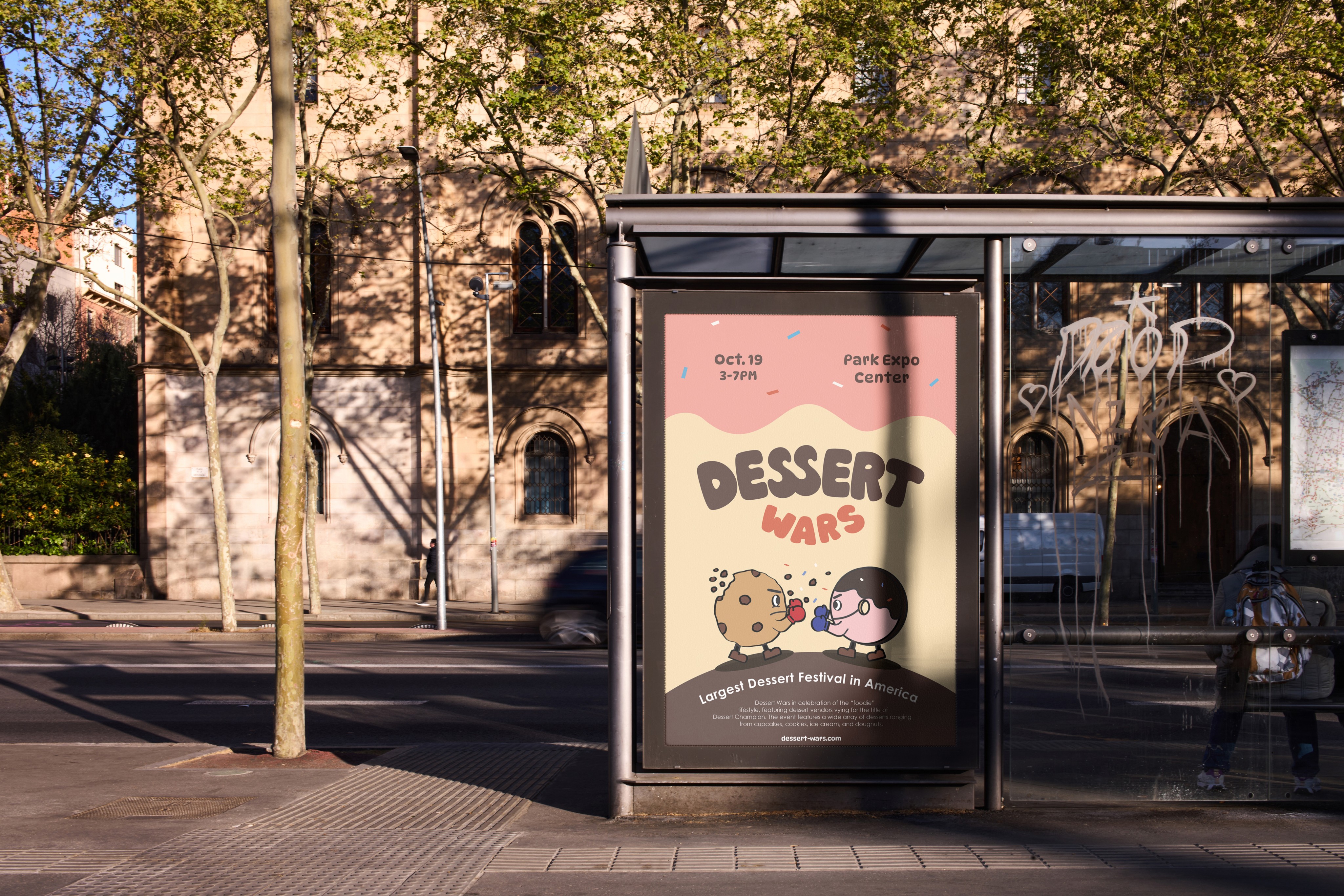
I initially explored adding a character to the logo, but it felt too busy, so I moved the character concept to the poster. Inspired by the festival’s bakery competition, I created a cookie and donut character competing with each other. The donut shape became the main background element, while DynaPuff added a playful, fluffy feel and Century Gothic kept the body text clean and readable.



TICKET
The ticket keeps the donut shaped background from the poster while presenting information in a clean and readable way. For a playful touch, I designed the right corner to look like it has been bitten.


BROCHURE
The map is designed in a donut shape, with the bakery lineup organized into three rows for easy navigation. I also created a stamp event where visitors can collect stamps from each booth and receive a gift. The back of the brochure includes a cookie-shaped stamp card.
Since visitors vote for the best bakery at the festival, I added a detachable voting ticket that can be placed into a voting box.


© 2026 SEBIN OH